ToxicoDB - A Toxicogenomics Brick
A python notebook for this post is available here
The toxicodb brick provides data from toxicodb.ca. In this post, we’ll use BioBricks.ai to look up gene and compound interaction data. To start, install biobricks.ai and then toxicodb:
Load toxicodb brick and start spark
import biobricks as bb, pyspark, subprocess, pandas as pd
import pyspark.sql.functions as F, pyspark.sql.types as T, pyspark.sql
subprocess.run("biobricks install toxicodb", shell=True)
toxicodb = bb.assets('toxicodb')
spark = pyspark.sql.SparkSession.builder.config("spark.driver.memory","4g").getOrCreate()
The toxicodb brick distributes tabular data about genes and compounds. It has 6 tables, but we’re going to focus on 3 of them:
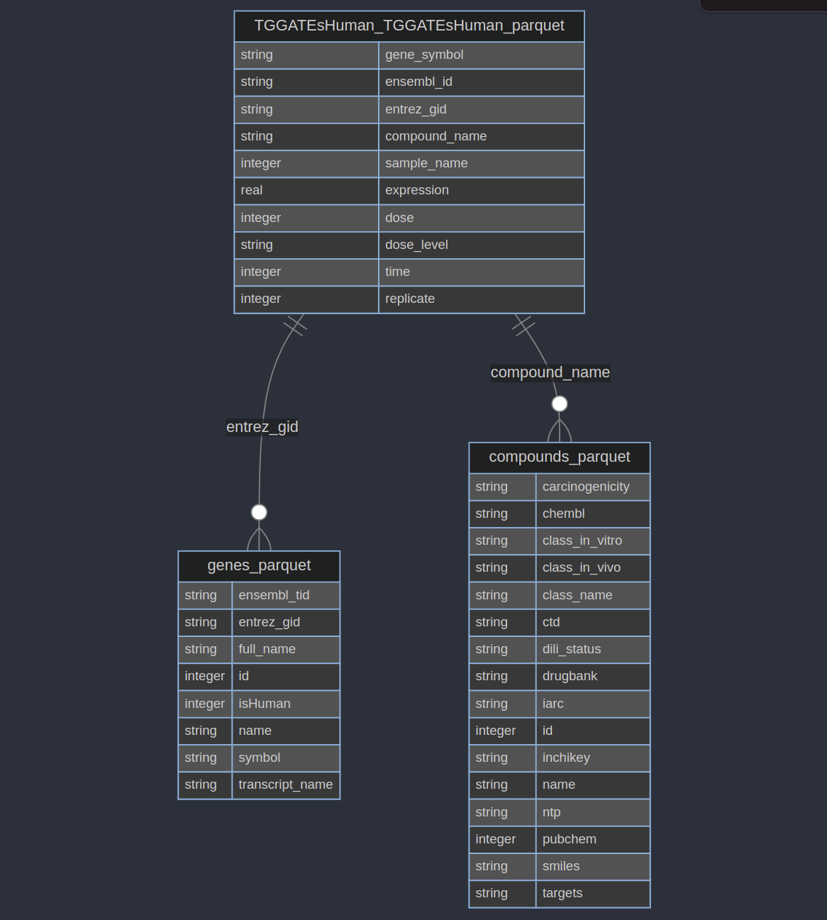
The TGGATEsHuman_TGGATEsHuman_parquet table has gene expression data for human cells treated with different dose levels of different compounds with different times. We will oversimplify this and find the mean expression for each compound, gene, and dose-level. This ignores a lot of important information (like time and replicates)! But we’re just demonstrating some data, not doing a real analysis.
human_expression = spark.read.parquet(toxicodb.TGGATEsHuman_TGGATEsHuman_parquet)\
  .groupBy("compound_name","gene_symbol","dose")\
  .agg(F.mean('expression').alias('expr'))\
  .orderBy("gene_symbol","dose")

# compound_name  gene_symbol  dose       expr
# Acetaminophen     A1BG-AS1     0  4.9268729
#     Flutamide     A1BG-AS1     0  5.1284958
# [9966500 rows x 4 columns]
Now we have expression values for different doses of different compounds! We can quickly calculate how the expression value of a gene changes for a compound between the lowest and highest dose:
from pyspark.sql import Window
win = Window.partitionBy("compound_name", "gene_symbol").orderBy("dose")
udf_change = F.udf(lambda arr: arr[-1] - arr[0], T.FloatType())
human_expression\
  .withColumn("expr", F.collect_list("expr").over(win))\
  .groupBy("compound_name", "gene_symbol").agg(F.max("expr").alias("expr"))\
  .withColumn("expr_change", udf_change(F.col("expr")))\
  .select("compound_name", "gene_symbol", "expr_change").toPandas()

#             compound_name    gene_symbol  expr_change
# 1-Naphthyl isothiocyanate    A1CF         -0.007111
# 1-Naphthyl isothiocyanate    A4GALT       0.182894
# [2910364 rows x 3 columns]
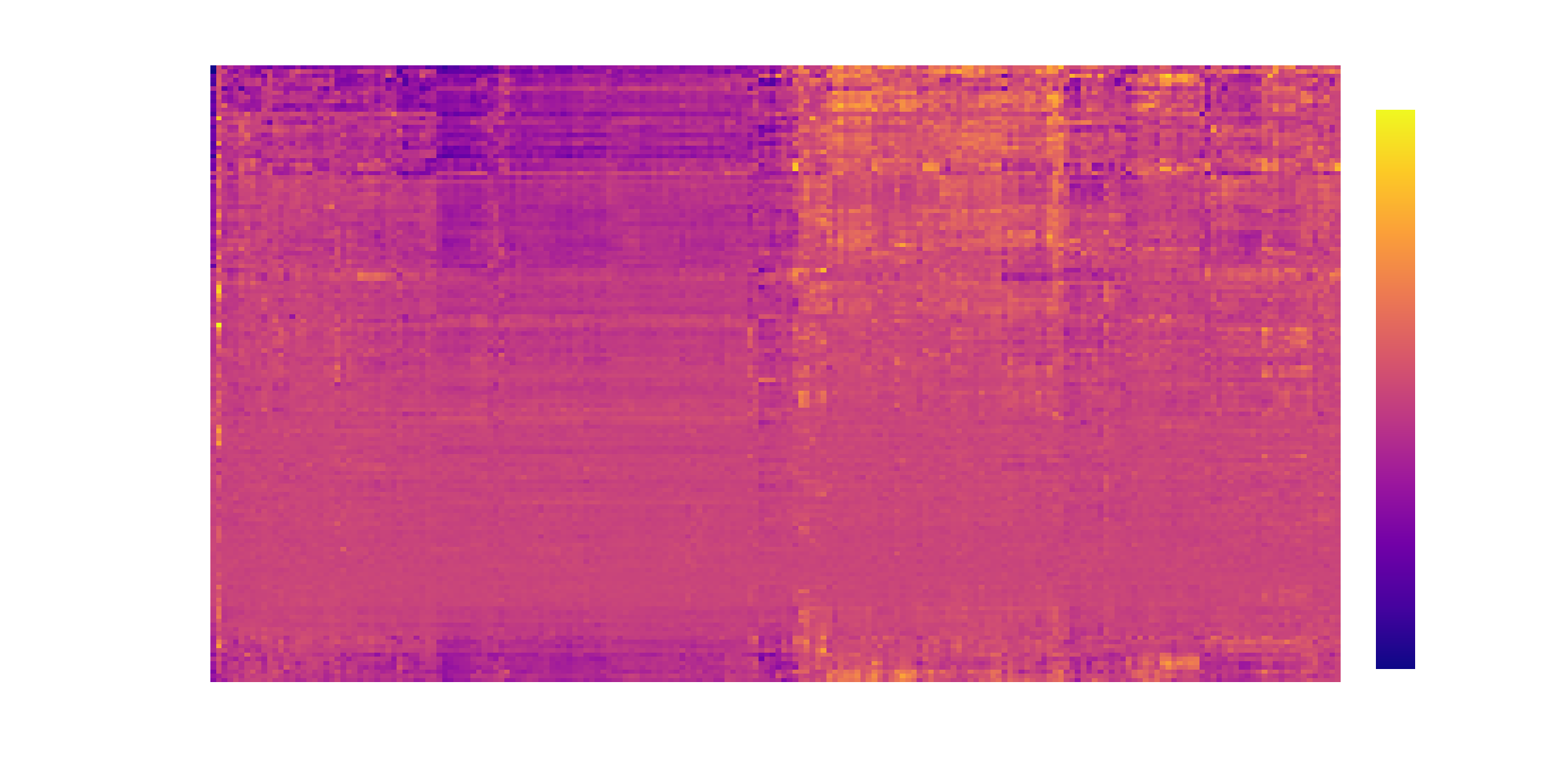
With this information we can build a clustered heatmap. In this heatmap the dark blue cells show genes that are downregulated at the highest dose compared to the lowest dose, and the red cells show genes that are upregulated at the highest dose compared to the lowest dose. The heatmap is clustered so that chemicals (on rows) with similar gene expression changes are grouped together and likewise for genes (on columns).
To learn how this plot was built, and see all the missing details in this post, check out the python notebook. There is also a simple python script available at 2024-04-08-toxicodb.py