Working with CPDB in python - Notebook
The below is the full python notebook for the post Working with CPDB in python.
Setup
python
import biobricks as bb
import pyspark
import pyspark.sql.functions as F
import matplotlib.pyplot as plt
import numpy as np
import seaborn as sns

cpdb = bb.assets('cpdb')
spark = pyspark.sql.SparkSession.builder.getOrCreate()

## build a table of chemicals, routes, species, and td50
ncintp = spark.read.parquet(cpdb.ncintp_parquet)
species = spark.read.parquet(cpdb.species_parquet)
route = spark.read.parquet(cpdb.route_parquet)
sdf = ncintp.join(species, 'species').select('chemcode','species','spname','route','td50')
sdf = sdf.join(route, 'route').select('chemcode','species','spname','rtename','td50')

## take the minimum td50 for each chemical
sdf = sdf.groupBy('chemcode','spname','rtename').agg(F.expr('min(td50)').alias('td50'))

## filter by td50 < 10000 and rtename in gavage, diet or inhalation
sdf = sdf.filter(sdf['td50'] < 1000)
sdf = sdf.filter(sdf['rtename'].isin('gavage', 'diet', 'inhalation'))

## count entries for each species and route
sdf.groupby('spname','rtename').count().sort(F.col('count').desc()).show()

df = sdf.toPandas() #data frame with chemcode, species, route, and numeric td50
Now that we have a pandas dataframe we can build some plots.
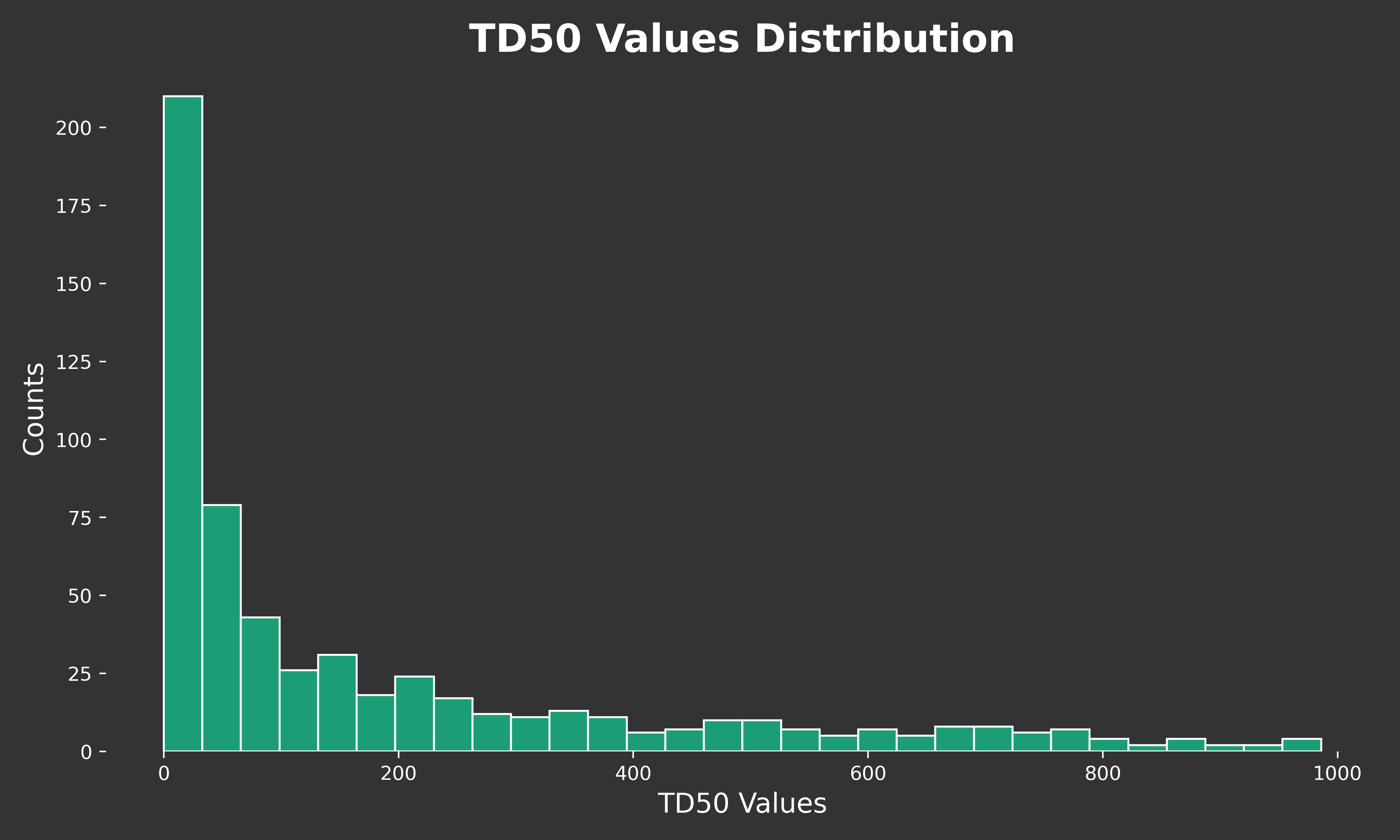
TD50 CHART
python
def td50_chart():
    # Creating the histogram with the updated data
    fig, ax = plt.subplots(figsize=(10, 6))

    # Plotting the histogram with all bars in greenish color
    ax.hist(df['td50'], bins=30, color="#1b9e77", edgecolor='white')

    # Setting the title and labels
    ax.set_title('TD50 Values Distribution', fontsize=20, color='white', fontweight='bold')
    ax.set_xlabel('TD50 Values', fontsize=14, color='white')
    ax.set_ylabel('Counts', fontsize=14, color='white')

    # Setting the theme
    ax.set_facecolor('#333333')
    fig.patch.set_facecolor('#333333')
    ax.tick_params(axis='x', colors='white')
    ax.tick_params(axis='y', colors='white')

    # Removing the frame
    for spine in ax.spines.values():
        spine.set_visible(False)

    # Adjusting the layout
    plt.tight_layout()
    plt.savefig('static/images/2024-03-12-cpdb/TD50_distribution.png', format='png', dpi=400)

td50_chart()
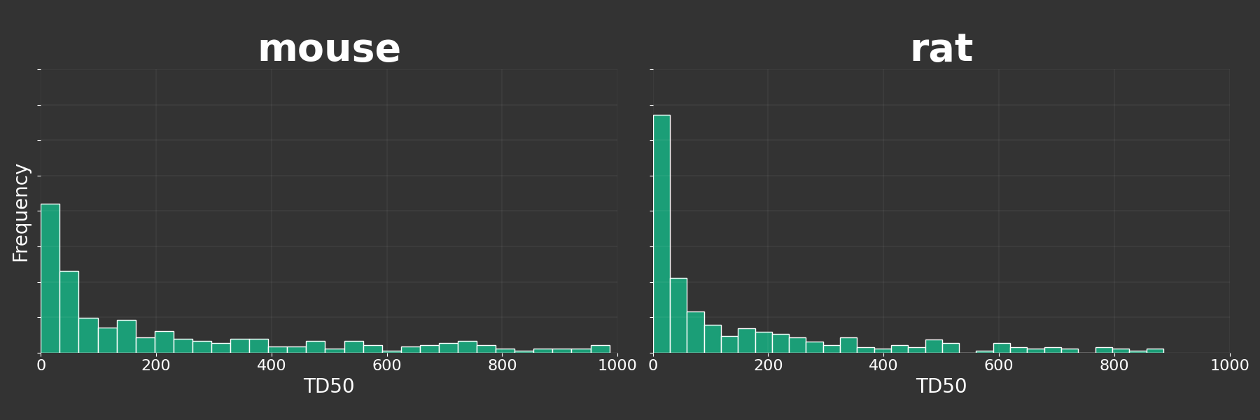
Build a plot for mice and rats
python
def species_analysis():

    colnames = df['spname'].unique()
    g = sns.FacetGrid(df, col='spname', col_wrap=2, height=6, aspect=1.5, sharex=False, sharey=True)

    # Map the histogram plot to the FacetGrid
    g.map(plt.hist, 'td50', bins=30, color="#1b9e77", edgecolor='white', density=True)

    # Customize the plot
    g.set_titles(col_template='{col_name}', fontsize=40, color='green', fontweight='bold')
    g.set_xlabels('TD50', color='white', fontsize=20)
    g.set_ylabels('Frequency', color='white', fontsize=20)
    g.set_xticklabels(fontsize=16, color='white')
    g.set_yticklabels(fontsize=16, color='white')
    g.set(xlim=(0, 1000))
    # Adjust subplot parameters to ensure the background is consistently dark
    g.fig.subplots_adjust(wspace=0.05)  # Reduce space between subplots
    g.fig.patch.set_facecolor('#333333')  # Set the figure background to dark

    for ax, title in zip(g.axes.flat,df['spname'].unique()):
        ax.set_title(title, fontsize=40, color='white', fontweight='bold')  # Adjust font size here

    # Remove the frame from both subplots
    for ax in g.axes.flat:
        ax.tick_params(colors='white', which='both')
        ax.set_facecolor('#333333')
        for spine in ax.spines.values():
            spine.set_visible(False)

        # Add a subtle white grid
        ax.grid(color='white', linestyle='-', linewidth=0.2, alpha=0.3)

    # Adjust the layout to fit the shared title and ensure consistency
    g.fig.tight_layout(rect=[0, 0.03, 1, 0.95])
    g.fig.savefig('static/images/2024-03-12-cpdb/TD50_distribution_mouse_rat_dark_bg.png', format='png', facecolor=g.fig.get_facecolor(), edgecolor='none')

species_analysis()
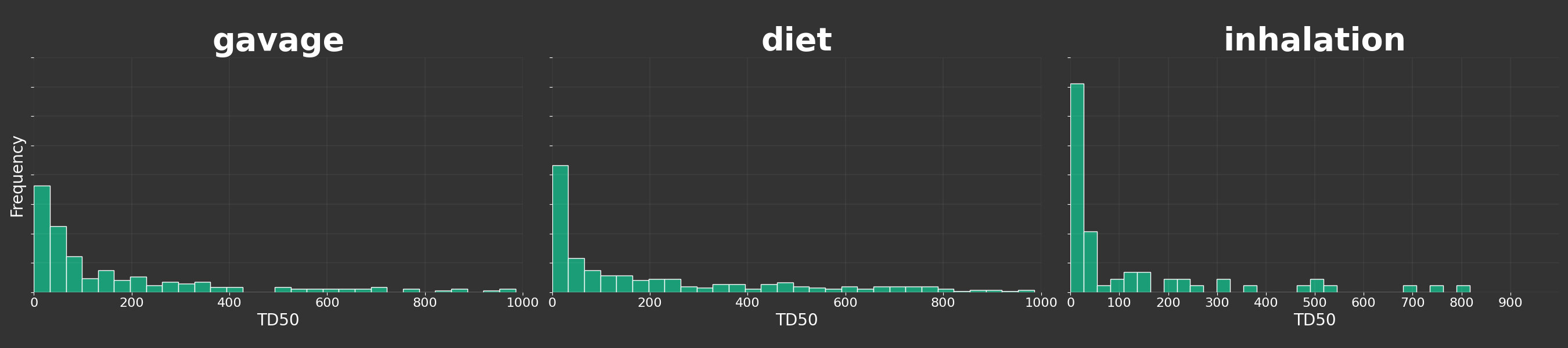
Build a histogram for each route
python
def route_analysis():

    # Create a FacetGrid
    g = sns.FacetGrid(df, col='rtename', col_wrap=3, height=6, aspect=1.5, sharex=False, sharey=True)

    # Map the histogram plot to the FacetGrid
    g.map(plt.hist, 'td50', bins=30, color="#1b9e77", edgecolor='white', density=True)

    # Customize the plot
    g.set_titles(col_template='{col_name}', fontsize=50, color='white', fontweight='bold')
    g.set_xlabels('TD50', color='white')
    g.set_ylabels('Frequency', color='white')
    g.set_xlabels('TD50', color='white', fontsize=20)
    g.set_ylabels('Frequency', color='white', fontsize=20)
    g.set_xticklabels(fontsize=16, color='white')
    g.set_yticklabels(fontsize=16, color='white')
    g.set(xlim=(0, 1000))

    # Adjust subplot parameters to ensure the background is consistently dark
    g.fig.subplots_adjust(wspace=0.05)  # Reduce space between subplots
    g.fig.patch.set_facecolor('#333333')  # Set the figure background to dark

    for ax, title in zip(g.axes.flat,df['rtename'].unique()):
        ax.set_title(title, fontsize=40, color='white', fontweight='bold')  # Adjust font size here

    # Remove the frame from both subplots
    for ax in g.axes.flat:
        ax.tick_params(colors='white', which='both')
        ax.set_facecolor('#333333')
        for spine in ax.spines.values():
            spine.set_visible(False)

        # Add a subtle white grid
        ax.grid(color='white', linestyle='-', linewidth=0.2, alpha=0.3)

    # Set a common/shared title for the subplots
    # g.fig.suptitle('TD50 Values Distribution', fontsize=24, color='white', fontweight='bold', va='center')

    # Adjust the layout to fit the shared title and ensure consistency
    g.fig.tight_layout(rect=[0, 0.03, 1, 0.95])
    g.fig.savefig('static/images/2024-03-12-cpdb/TD50_distribution_route_dark_bg.png', format='png', facecolor=g.fig.get_facecolor(), edgecolor='none')

    # Show the plot
    plt.show()

route_analysis()
Get Most Toxic Examples
python
chemname = spark.read.parquet(cpdb.chemname_parquet)
intp = spark.read.parquet(cpdb.ncintp_parquet)
min_td50 = intp.groupBy('chemcode').agg(F.min('td50').alias('td50'))
df = min_td50.join(chemname,'chemcode').sort(F.col('td50').asc())
df.select('name','td50').show(10,truncate=False)
# +-----------------------------------+-------+
# |name                                |td50   |
# +------------------------------------+-------+
# |2,3,7,8-TETRACHLORODIBENZO-p-DIOXIN |1.21E-5|
# |HCDD MIXTURE                        |5.96E-4|
# |o-CHLOROBENZALMALONONITRILE         |0.00649|
# |OZONE                               |0.0156 |
# |RIDDELLIINE                         |0.0267 |
# |THIO-TEPA                           |0.0332 |
# |OCHRATOXIN A                        |0.0579 |
# |POLYBROMINATED BIPHENYL MIXTURE     |0.0645 |
# |COBALT SULFATE HEPTAHYDRATE         |0.0826 |
# |LASIOCARPINE                        |0.102  |
# +------------------------------------+-------+